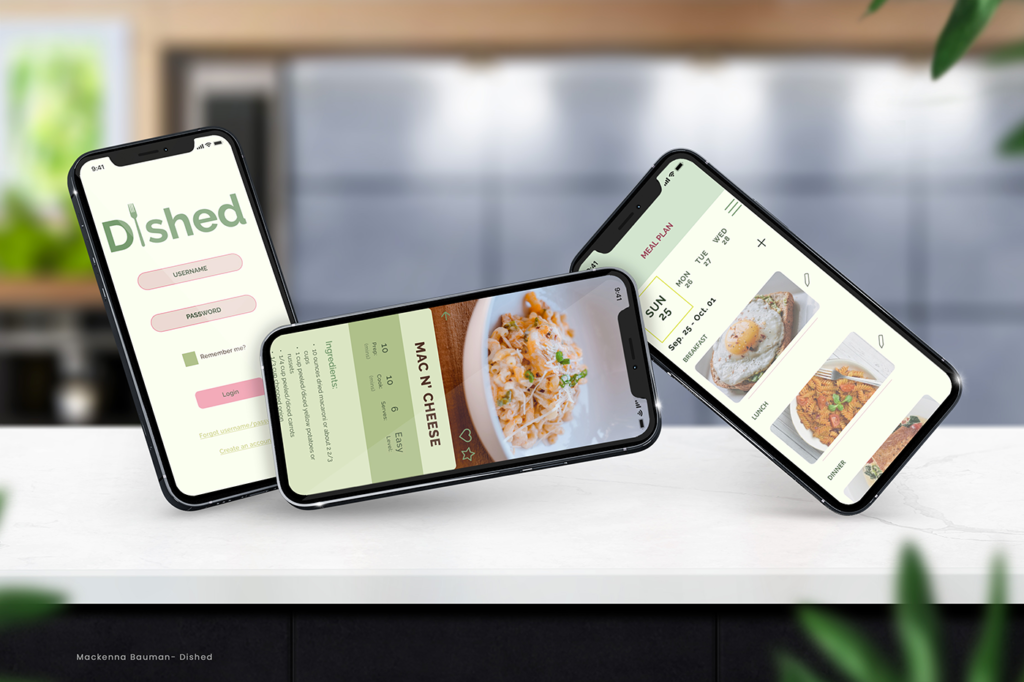
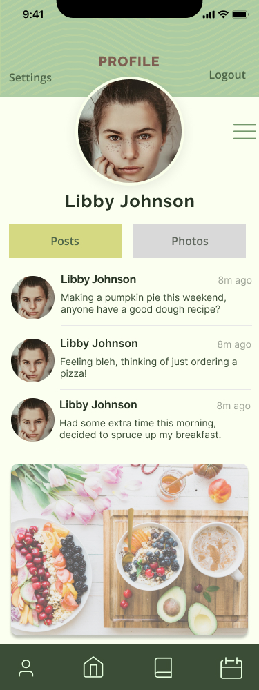
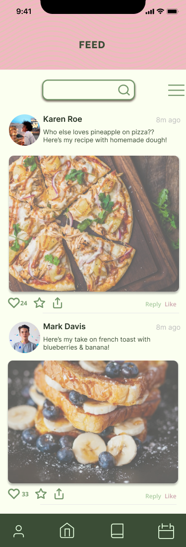
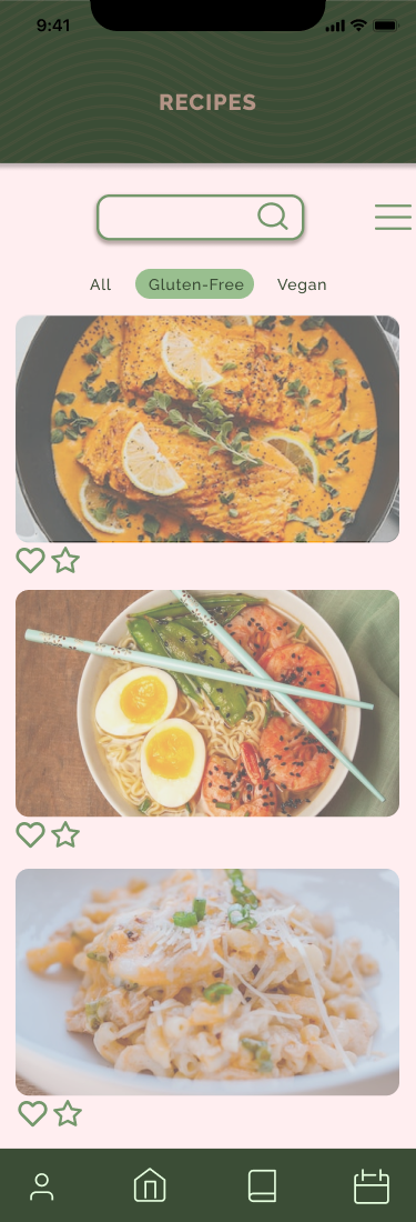
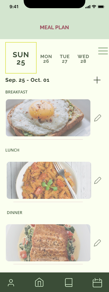
While more people spend time at home because of Covid, it’s normal to often feel lonely and uninspired. Dished allows everyone and anyone to not only connect on a new social platform, but by also finding different recipes to try out. Whether you’re a pro in the kitchen or just starting out, there’s sure to be recipes that you can enjoy with friends, family, or by yourself.
User Research, User Interviews, Wireframing, UX Design, UI Design, Prototyping
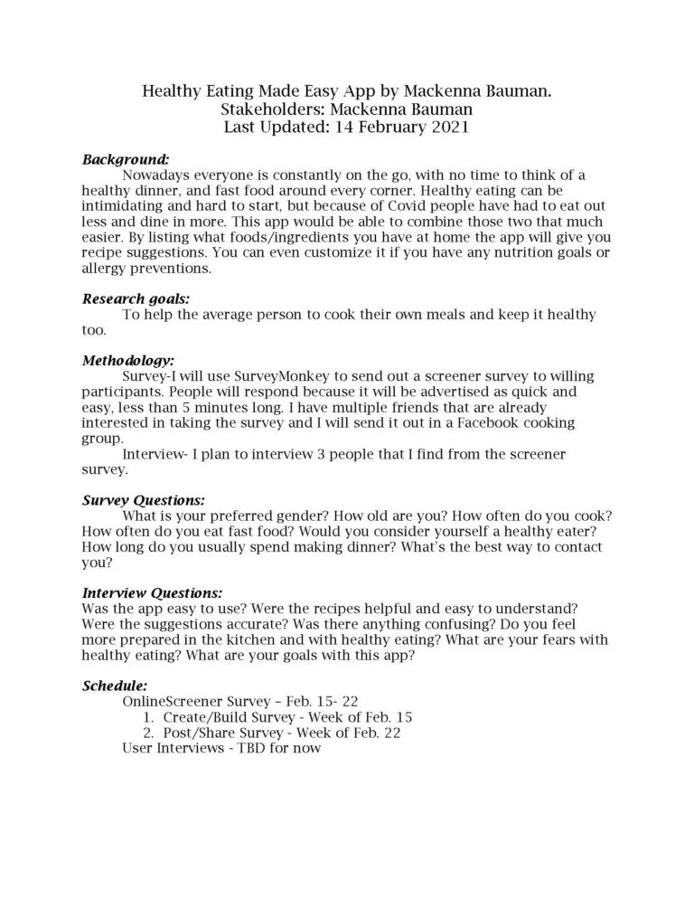
Research plan:
When I first started creating my app the very first thing to do was create a research plan. Listing out what all of my goals were, background information, methodology, as well as what survey and interview questions I wanted to ask. To make sure everything stayed on track and was completed in time I had also created a schedule to follow out.
user surveys & interviews:
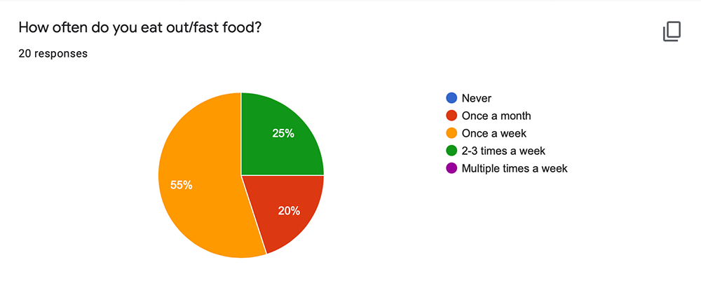
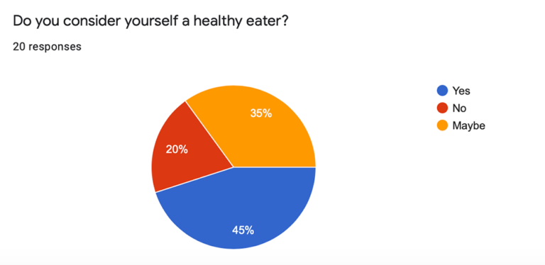
From my survey I got over 20 responses, with a lot of varying results. At first I had trouble getting results and those to take my survey, I tried posting in multiple Facebook cooking groups, and Reddit pages. After some waiting I had found users on Reddit can be most helpful and I had gotten more responses than I thought I would get. I then went on to interview 3 separate people to get even more in-depth answers to what their needs and priorities are.
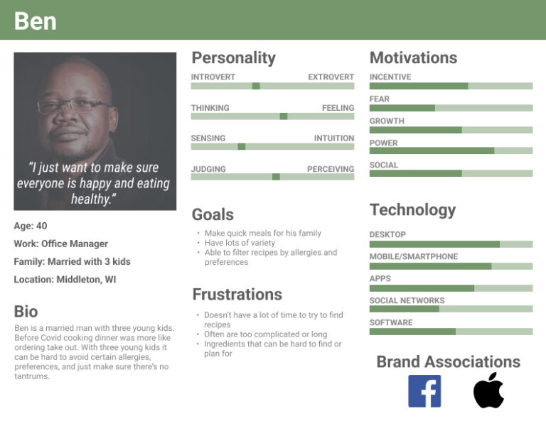
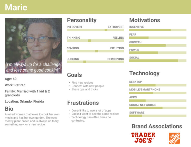
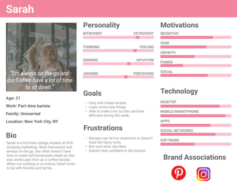
personas:
After my interviews I started thinking of who might possibly use this app and what would be those reasons. I then came up with 3 different personas, all different ages, jobs, interests, families, etc, and each had a different reason for why they would want to use Dished.
Previous
Next
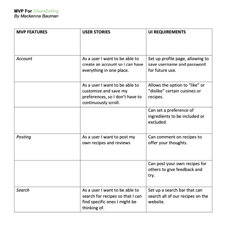
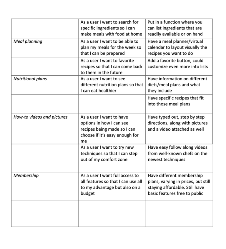
mvp, user stories, & requirements:
I then came up with a Minimum Viable Product (MVP) by doing a competitive analysis on other similar apps, taking inventory of their features and their design. I then came up with a list of features that my app should include as well as creating user stories of why a user might want that feature.
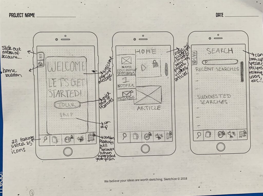
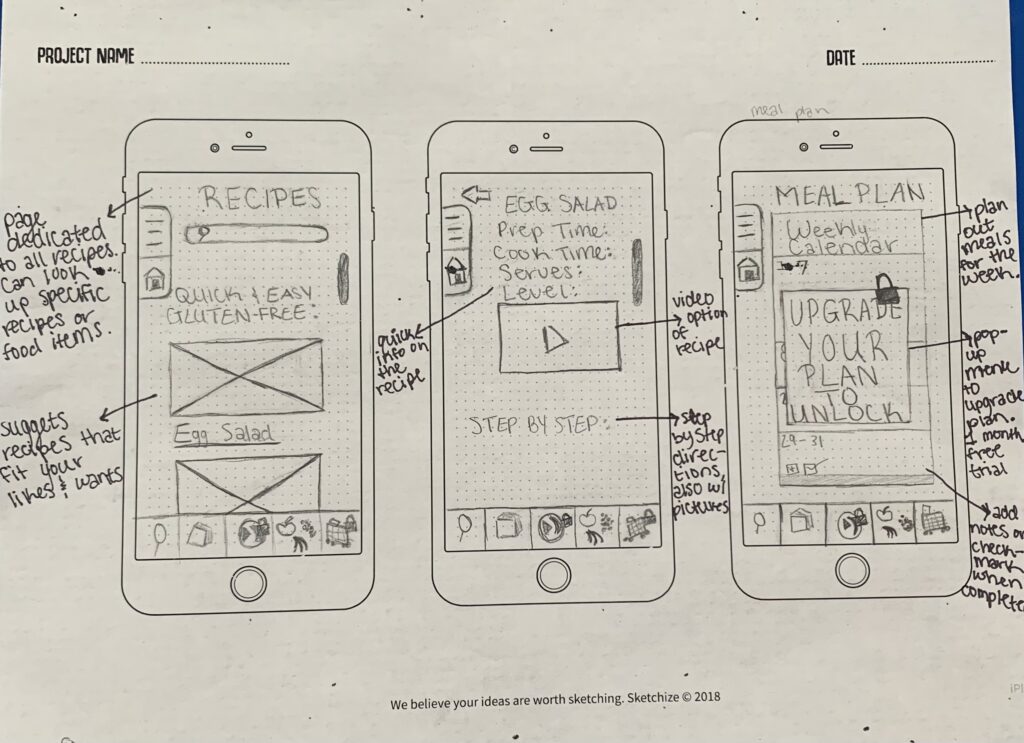
lo-fi wireframes:
Once I knew what features and information I wanted to include, as well as navigation, I began my low-fidelity wireframes. First by hand drawing, then moving onto Adobe XD for my first iteration.
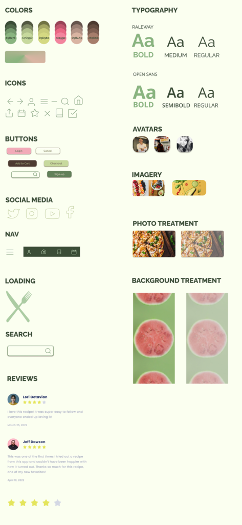
style guide:
Now that the layout has been decided on, I moved onto choosing colors, fonts, icons, and more. Deciding on all of that can really make it start to come to life.
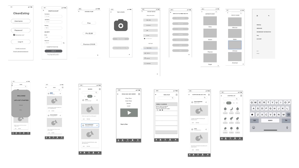
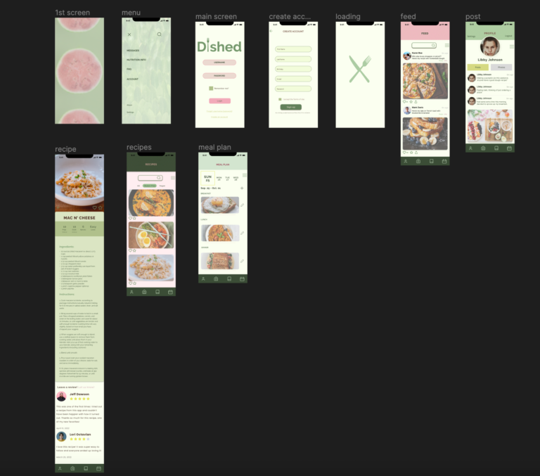
schematic design:
I could now start to add my style to all of my new wireframes created in Figma for iteration 2.
Previous
Next
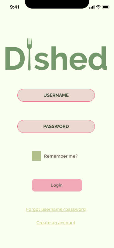
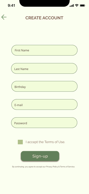
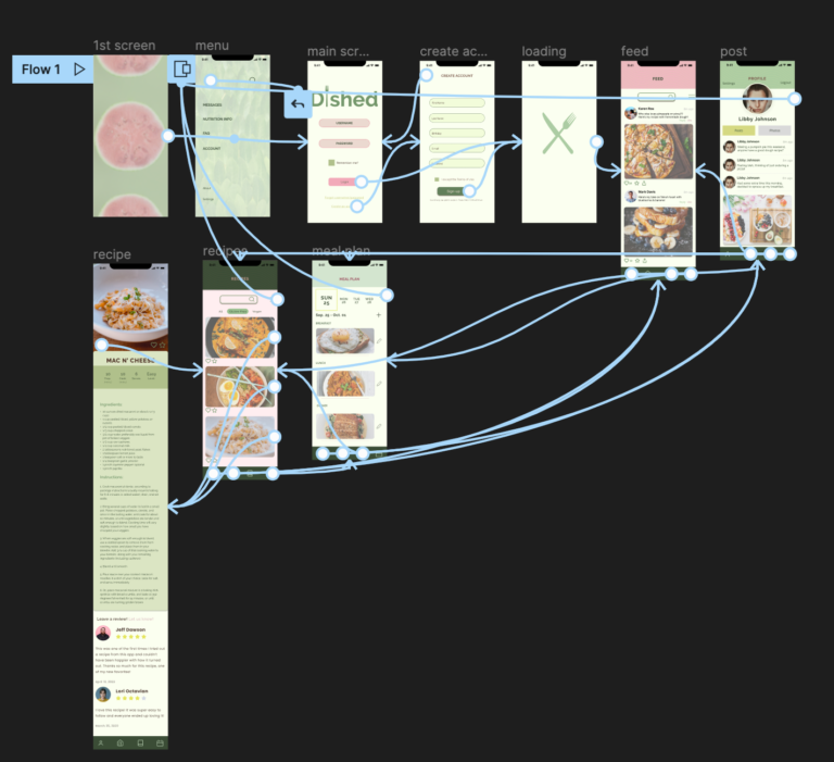
prototype:
Last step was to now prototype my artboards together, while also creating micro interactions throughout, creating the feeling of a real app. Check it out for yourself!