Spirit Halloween website redesign

background:
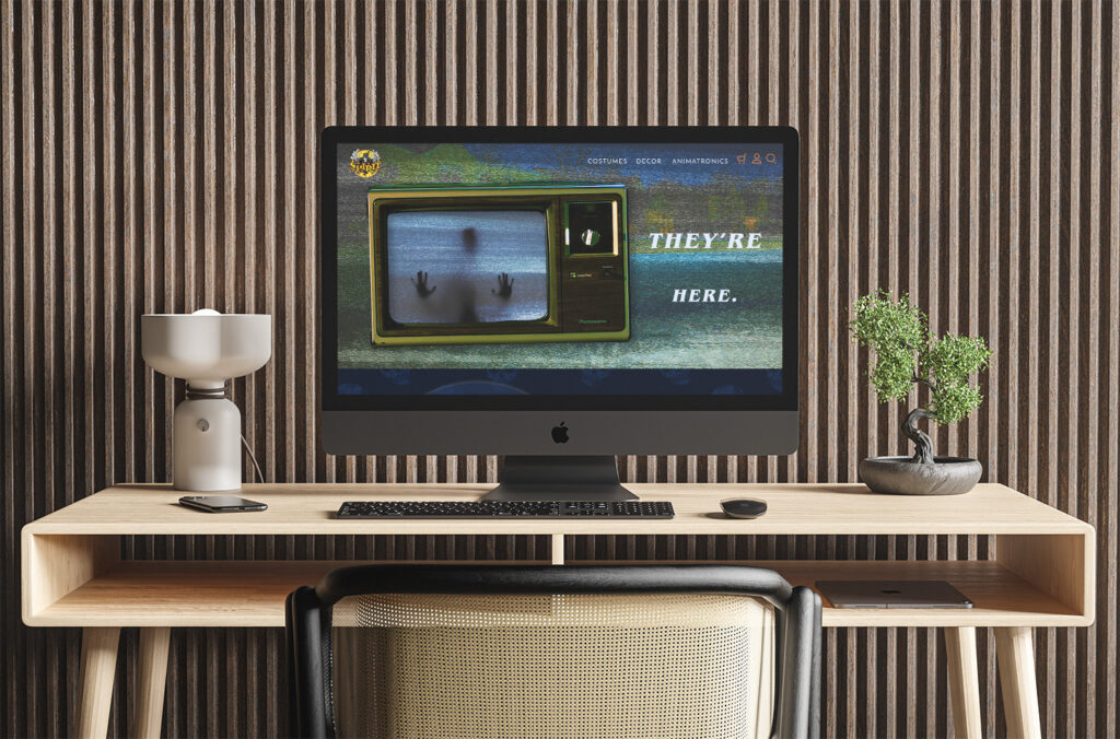
With Halloween being one of my favorite holidays I knew that this final semester I had to do something spooky and scary. What better brand to redesign their website other than Spirit Halloween? Spirit Halloween helps so many people get their scare on, whether it’s through costumes, decor, or animatronics, there’s bound to be something for everyone. However, their current website gives more of a sigh than a scream, and I wanted to bring some of that old-school horror back.
software:
Adobe Photoshop, Adobe Illustrator
skills:
Concepting, Wireframing, Photo Manipulation & Treatments, Web Design
concepting & moodboard:
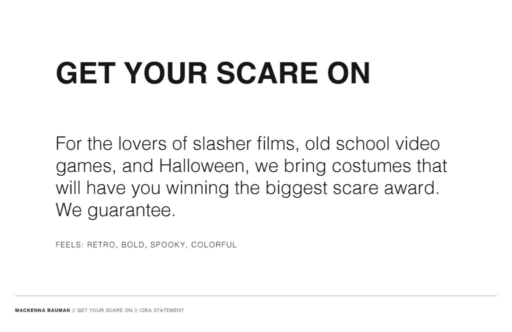
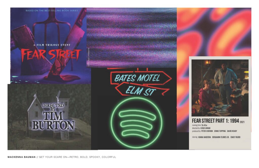
I first had to decide what kind of feeling I wanted to invoke when people would visit this site. I dug into what I like for Halloween, while trying to be different than what you might typically see. I found that I really like the old slasher camp vibe, while incorporating a retro theme. I drew inspiration from Fear Street movies, as well as old polaroids, tv static, and neon lights.


wireframes:
Before I started the visual design I first wanted to get a basic concept of where everything should be, while also making sure to use guides and rulers so that everything was evenly spaced and that there was clear hierarchy.
schematic design:
Now that I was happy with my concept and knew the direction I wanted to go in, it was time to get started. I found a lot of different textures to bring in throughout the site, while having a bit more of a darker color palette, and some fun graphic elements. I wanted to also try pushing what might be considered as typical visual cues. such as you might not expect your product carousel to be inside of an old tv.
